
Redefined Cart & Checkout: Gaining user trust through order accuracy & ease

Background

Experience:

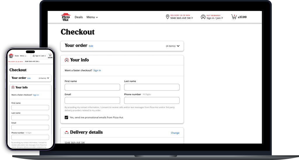
Website Cart & Checkout

Company:

Pizza Hut

Role:

Senior UX Designer II

Collaborative Partnerships:

Thoughtworks
UsableNet
Applause

Overview & Objectives:

This case study explores the transformation of the checkout experience made possible by a migration from a legacy PHP codebase to a modern React/JS framework. Leveraging the flexibility and speed of the new framework, the UX team reimagined the checkout flow to streamline steps, improve order accuracy, and reduce friction. By simplifying the review & pay process, the redesign aimed to build user trust, reduce cart abandonment, and enhance overall conversion rates.

Scope of Responsibility:

As the design lead on this project, I was responsible for mapping key user flows, designing the complete user interface, developing prototypes for usability testing, and defining all relevant use cases.

Tools:

Figma

Usertesting.com

Mural

Confluence

Jira

Process

Problem Statement:

Users ordering pizza on the website face a cumbersome checkout process with unnecessary steps and limited feedback, leading to friction and order abandonment. Redesigning the cart and checkout to streamline the process and improve order accuracy will create an experience that builds trust and positively impacts conversion rates.

User Data & Pain Point Discovery:

Key Analytics Insights:
  • Mobile users are less likely to enter a credit card
  • Mobile users are half as likely as desktop to be signed in at checkout
  • Authenticated users complete details 5% more often than guests
Percentage of sessions making it to checkout:

Mobile Web

44.3%

Desktop

56.9%
Bottom of funnel completion rates:

Mobile Web

80.1%

Desktop

83.5%
Cart:
Confusing Type Hierarchy:
The lack of visual structure can hinder the customer’s ability to review relevant order details and ensure that their order is correct
Too Many CTAs:
This can create confusion about next steps, dilute the significance of each action, and lead to visual fatigue
Inconsistent Treatment of Cart Actions:
When these controls are not positioned predictably, customers may struggle to locate them quickly, leading to inefficiencies in managing their cart items
Checkout:
Disruptive Sign in Step:
This step interrupts the purchase flow, heightens the risk of sign-in errors if credentials are forgotten, and may deter new guest shoppers from completing their order.
3-Step Flow:
Separating checkout steps into multiple pages can feel like extra work and makes it harder to review all details before submitting the order.
Delivery & Carryout Details:
Presenting optional inputs by default can overwhelm users before reaching the payment step.
Placeholder Text in Fields:
It disappears as users type, making it challenging for screen reader users and those with cognitive impairments to know the expected input and identify incomplete fields.
Payment Fields:
The payment section may give the impression of being disabled to some users because of the use of gray for the active expanded state.

Define Primary Design Goals

1. Increase Accessibility

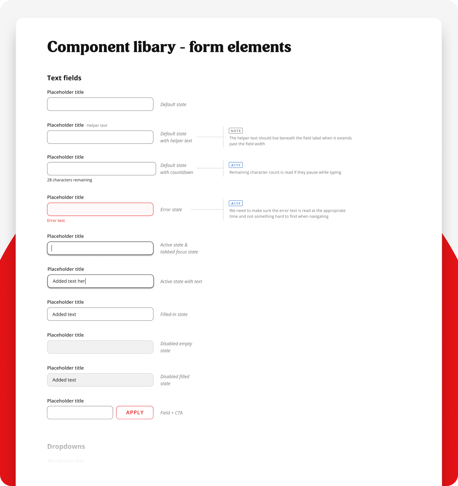
Creation and implementation of a modernized, accessible design system approach

2. Simplify Cart

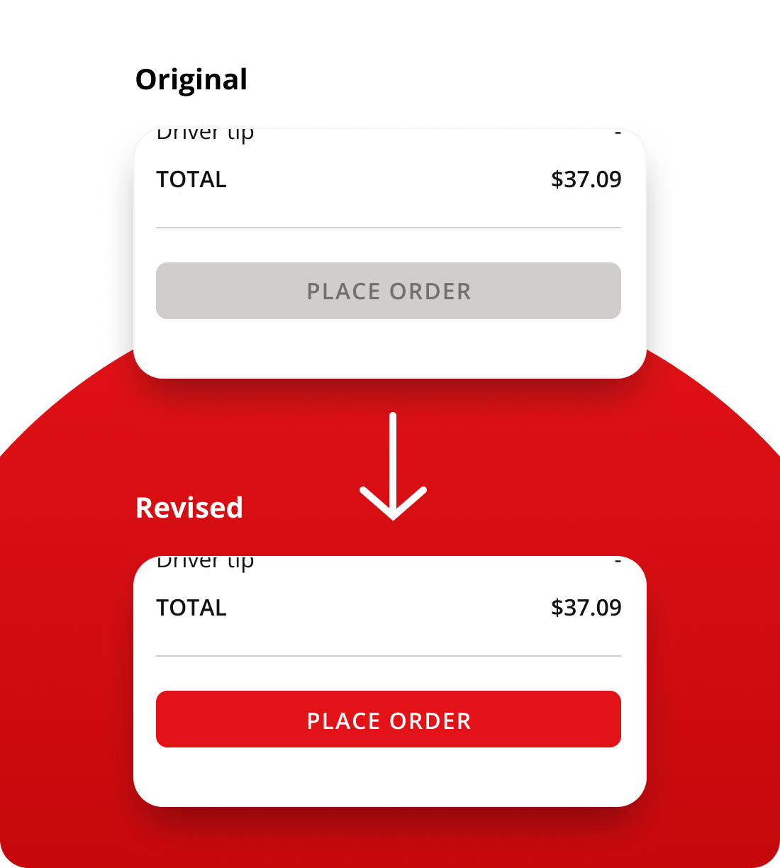
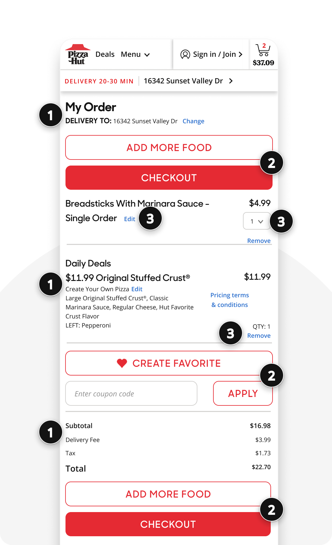
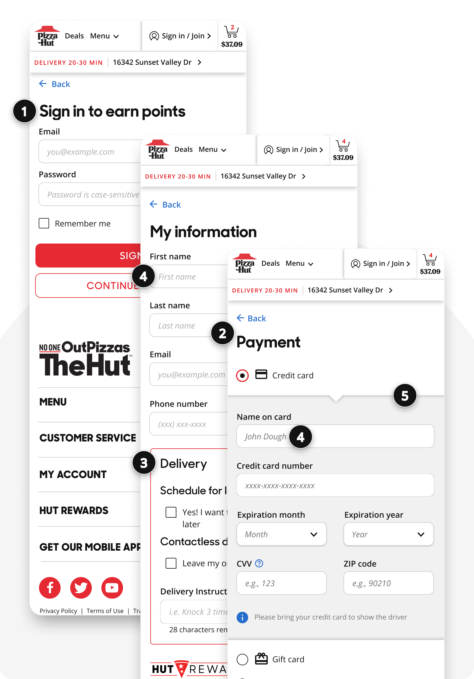
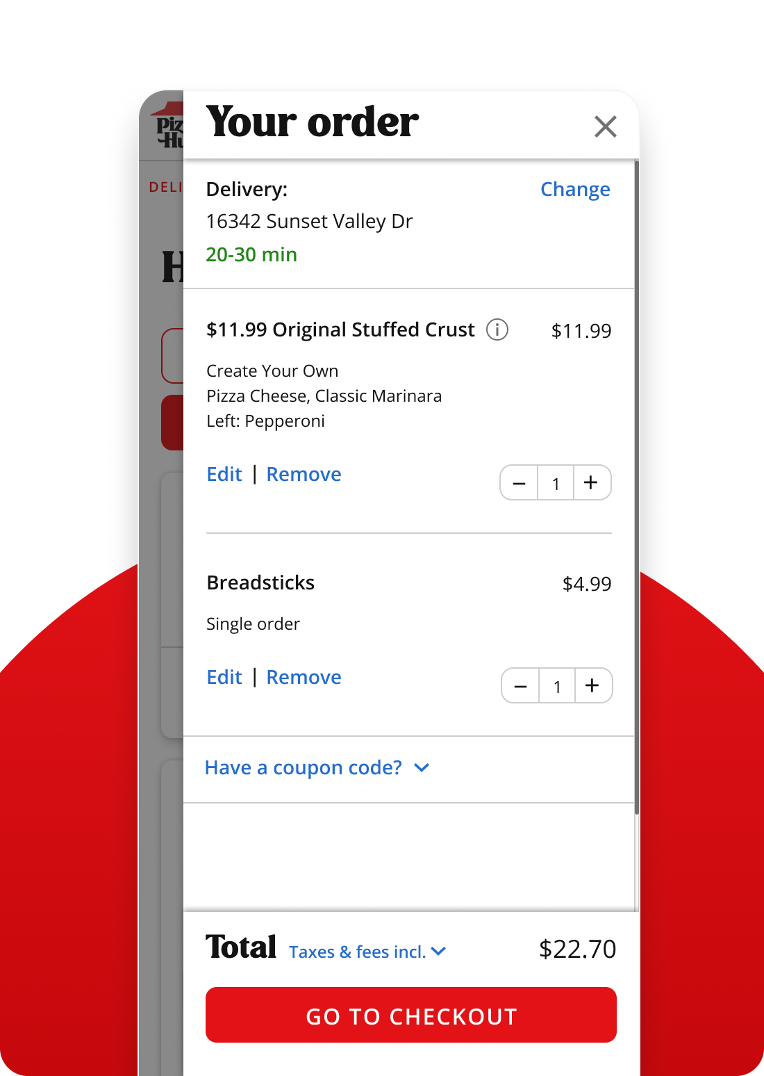
Reimagining the cart design for easier order review to increase order accuracy

3. Streamline Checkout

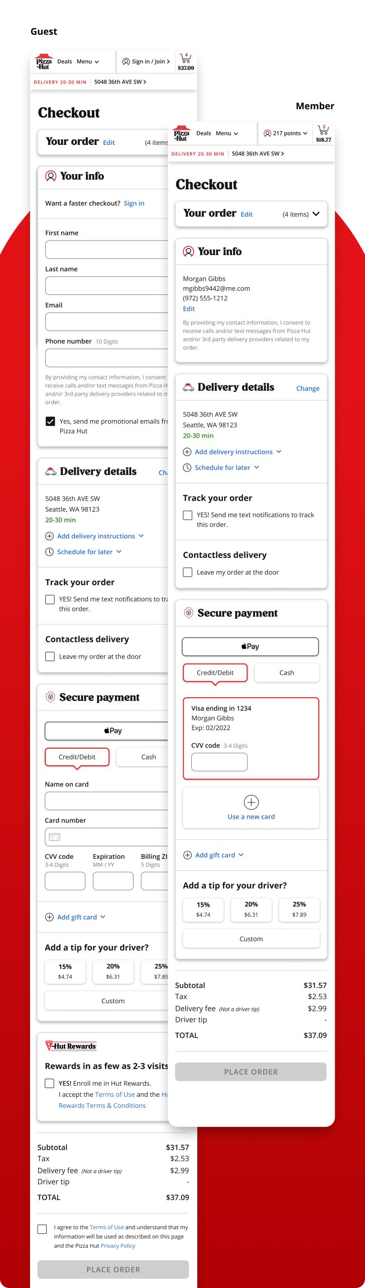
Simplify the checkout process to enhance ease of use and reduce both errors and cart abandonment

Design Solutions & Execution:

Goal 1: Increase Accessibility
Solution: Creation & implementation of new 2.0 design system

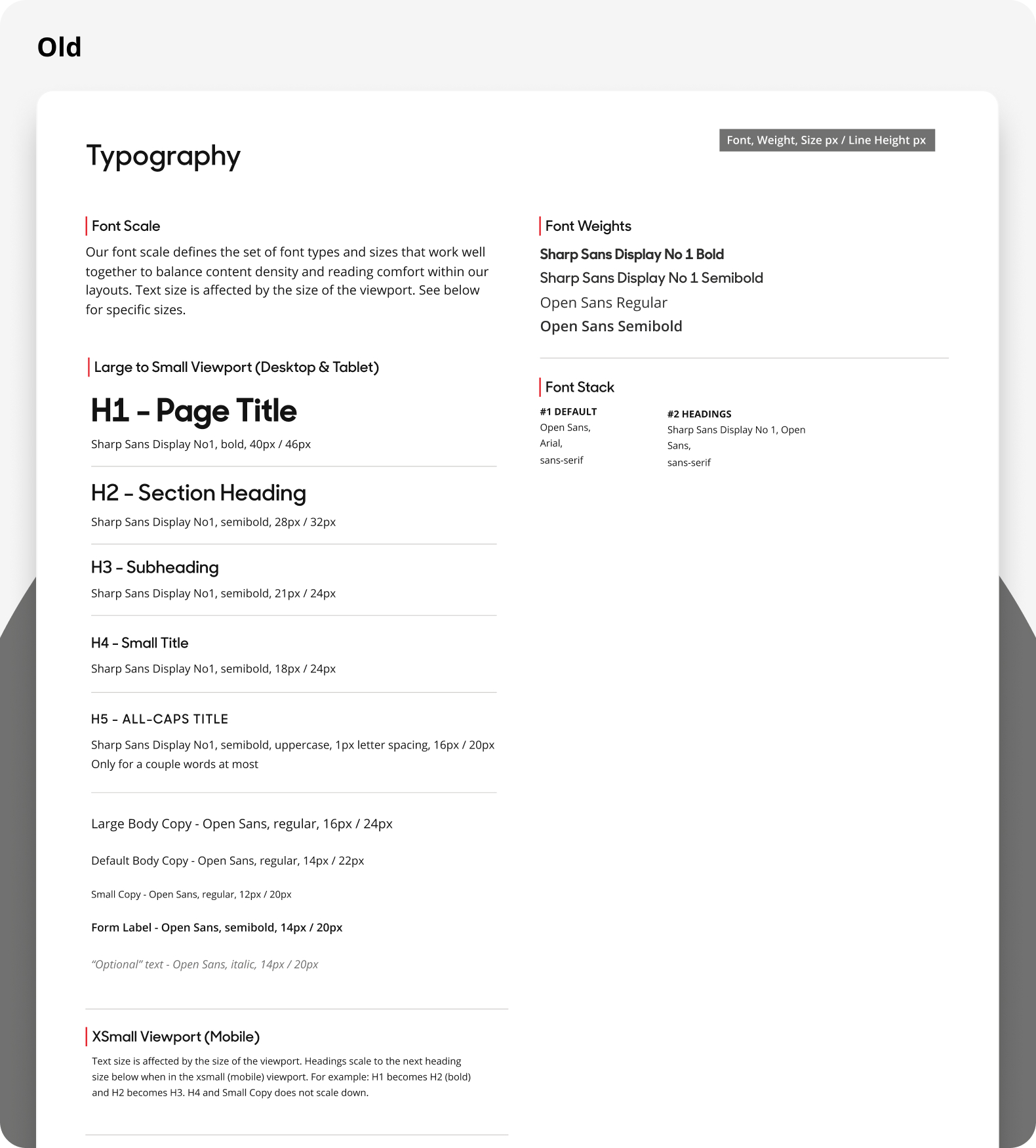
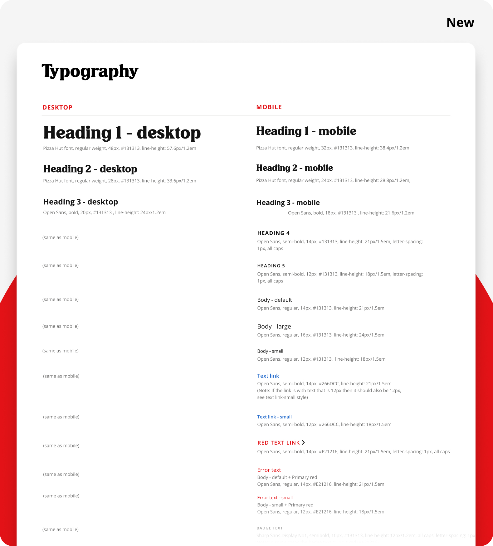
Typography Key Unlocks:

Redefined mobile-first type hierarchy approach
Modernized brand expression through the use of the Pizza Hut font

Use slider to compare old vs new

Form Element Key Unlocks:

Established new form field styles with accessibility top of mind
Created improved error states for contextual feedback

Goal 2: Simplified Cart

Key Unlocks:

Slide out rail allows for quick & easy cart review throughout the shopping experience
New type hierarchy & standardized spacing enables faster scanning of important details
The primary call to action, “Go to Checkout,” remains clearly visible at all times with a sticky footer approach
Primary item-level functions are consistently placed

Goal 3: Streamlined Checkout

Key Unlocks:

Allowing users to checkout as a guest avoids a potentially friction-filled sign-in process, reducing the risk of blocking order completion
Switching from a 3-step to a single-page approach enables easier detail review and creates a perception of less work for users
Updated form styles and error handling enhance real-time contextual understanding
Collapsing optional inputs helps users more easily identify the required steps to complete their order
A modernized, user-friendly payment section enhances customer confidence in secure transactions

Test & Learn

User Testing Findings:
The designs were tested by 10 users on their mobile devices via Usertesting.com

New checkout tested approximately 37% faster than the legacy design
The information page in the legacy checkout was the primary cause of longer time on task

Post-Launch Finding:
After launching the new experience, one major blocker was discovered

While inline error messages had been enhanced, the use of a disabled CTA button prevented users from being redirected to existing errors.
Recognizing this significant barrier, we quickly implemented a solution to keep the Checkout CTA always active. Tapping the button now automatically scrolls users to the first errored field, offering contextual guidance for necessary corrections before completing checkout.

Launch Completion: June 2022

Post-launch, mobile web checkout conversions have risen by 6–7% on average, with desktop performance remaining steady, reinforcing that our improvements were uniquely impactful for mobile users.

PizzaHut.com was responsible for over $2.5B in e-commerce sales from over 245M users in 2023